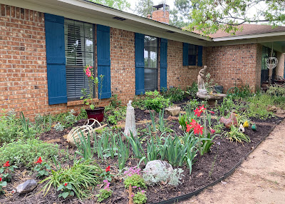
Our farmhouse is a cozy 1250 sq. ft. house. Not tiny but smaller than what we have in the city. I don't mind...I'm ready at this stage in life to downsize.
It was pure country when we found it. Brown paneling, brown cabinets, brown floor...lots of brown. Yay for paint!
In the living room, the fireplace sits on a diagonal at one end, creating this awkward layout with this really high shelf for the mantel.
And the room is about 14 ft. wide, with the front door opening directly into the living room.
I definitely didn't want the sofa on the lefthand wall close to the front door - it would be smack in the traffic pattern!
Of course, we started with the couch on the righthand wall (why do we do that?) but it really didn't make the room feel cozy. Plus, it left us with putting a tv where everyone would walk in front of it. Bad.
 |
| sofa facing the lefthand wall |
That chair by the fireplace and wall felt crammed in there. The other one didn't really work in its spot.
Oh dear! I needed fresh eyes on the space. So last week when my friend Mira came up to go to Canton, we spent that afternoon editing, cleaning, and rearranging both the living room and the dining room.
We tried things here. We tried things there. We made a mess. Then at last, success! The dog kennel was the main obstacle in the placement of a chair so it got moved by the back door (hopefully in the future, it will be in a completely different room but this is reality for now). Of course, that started a chain reaction of moving things in the dining room. ha!
Back to the living room: The couch got moved from in front of the window to facing the righthand wall, creating a walkway from the front door to the dining room and hallway. Now when you walk in the front door, there's a definite pathway and it feels like an entryway.
 |
| I need a rug! Plus I think the ladder and throw need to be moved. |
And the tv is easy to see from both the couch and chairs! Yippee!
The table that used to be by the front door got repurposed for the tv stand:
They fit perfectly!
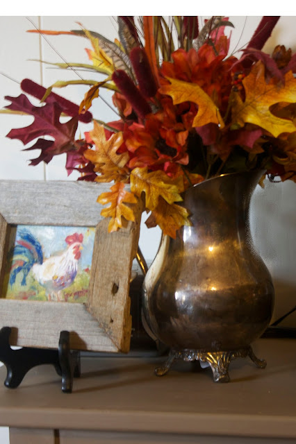
Of course, we had to decorate for Fall:
Fall sign and pretty faux foliage:
And the book page decoupaged pumpkin along with other Fall decor:
Someday it will undergo another transformation (when we move here and bring our permanent furniture). But for now this works and gives me a blueprint for the future.
My takeaway from this? Keep moving things around until it works. Don't be afraid to try out different layouts or to completely remove some items. And if that's not enough, bring a friend up who can see things with fresh eyes. Sooner or later, something will click.
Sharing at these parties:
Redo It Yourself Inspirations Homemade and Handcrafted


Cecilia, I love the new arrangement--it's perfect and very cozy! I think if we're honest, most of us feel the way you described at times. The C.S. Lewis quote, "Comparison is the thief of joy," is always a good reminder for me ;) I'm really enjoying watching your home blossom! Hugs, Cecilia
ReplyDeleteI love the new arrangement too!
ReplyDeleteI have to say... I envy you the courage and generosity to open your home to your friend and 'LET' her help you with it!
I CAN NOT do that! I want to do it...but I can't let go of the reign and admit defeat (though doing so would be winning?) ...I can't do it.
So kudos to you for being able let her help.
I love it!
Love it! I was actually thinking I would put the sofa in that spot to create an entry and that's just what you did as I scrolled down. Everything looks so homey and cozy! I love the colors too....so warm. I have the same problem with no real entry and my living room is so small. But, I make do. Have a wonderful week!
ReplyDeleteHugs, Vicky
Mira is a treasure as are YOU.
ReplyDeleteYou arranged the room exactly as I would. My mother taught me many years ago that sometimes we have to create walkways in rooms and you did.
Now to your first concern.
Everyone in blog land has felt the same way at one time or another.
I have too , which is when I it is time to turn off the computer:)
Love to you!
Laura
WSP
Oh Laura, Thank you! Your comments are so sweet. You're right, turn off the computer when the comparisons start. I think there are times I'm still figuring out my style so I question everything I do. And I love so many styles so when I see someone's blog and they have thus beautiful style, I wonder if that's the direction I should go. I just need to learn to trust myself and go with what works for us.
DeleteLove back!
Cecilia
Furniture definitely has to be arranged right to make a room flow. We have paneling in our farm house too, so I smiled and painted, it doesn't bother me at all. It's funny when you live on a farm those little things that would drive me crazy in the city are now overlooked. As I get rid of our stuff though I'm finding it more difficult to arrange the furniture that remains, it may be time to move that couch. Looks Great!!
ReplyDeleteCarole @ Garden Up Green
Lol, your comments made me laugh! It's all a mind set, isn't it? I love the paneling - just not plain off the shelf brown. Painted white on the other hand, I absolutely love! Thanks Carole! You do manage to help me keep things in perspective. :-)
DeleteIf I was with you, I'd smack you upside the head for thinking your abode isn't good enough. Goodness, it's a heavenly place and it makes you happy, and that's all that matters.
ReplyDeleteKudos to you and mila for figuring out a layout you like. It's not easy sometimes when we need to take elements like fireplaces into consideration, but you tamed the beast!
XXX
If I was with you, I'd smack you upside the head for thinking your abode isn't good enough. Goodness, it's a heavenly place and it makes you happy, and that's all that matters.
ReplyDeleteKudos to you and mila for figuring out a layout you like. It's not easy sometimes when we need to take elements like fireplaces into consideration, but you tamed the beast!
XXX
I love the new layout in the farmhouse living room. I agree, sometimes it takes fresh eyes to solve a problem and you and your friend did a great job.
ReplyDeleteYou have nothing to be concerned about with comparing your space to others. You share photos of both of your homes and I am always impressed with how comfortable they are and so pretty. Keep up the good work, you certainly inspire me :)
It looks beautiful Cecilia!
ReplyDeleteTania
Yes...sometimes you need that second eye to have that ah-ha moment....Your farmhouse is beautiful!
ReplyDeleteThank you, Shirley. It's a cute little house. I love it.
DeleteLove this arrangement Cecilia ... looks so comfortable. My first thought was exactly where you placed the couch. I have the same problem in our living room ... a TV, fireplace, a wall of windows and patio doors. I have our couch sitting out from the wall facing the fireplace. This directs the flow of traffic as yours does.
ReplyDeleteYou did a great job with the layout, it looks terrific! Honestly, I'm bored with the homes that look like magazines, our real life homes are so much better. :)
ReplyDeleteThis is fantastic and I never would have been able to come up with that. I love that you have a comfortable layout. Your fall decor is completely darling.
ReplyDelete